
Wuhletal is a berliner housing cooperative that launched a pitch for a rebranding. The new corporate design should reflect the green parks that surround their houses, and reinforce the commitment and reliability with their members.
New corporate image
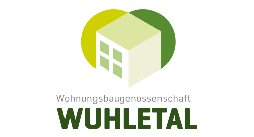
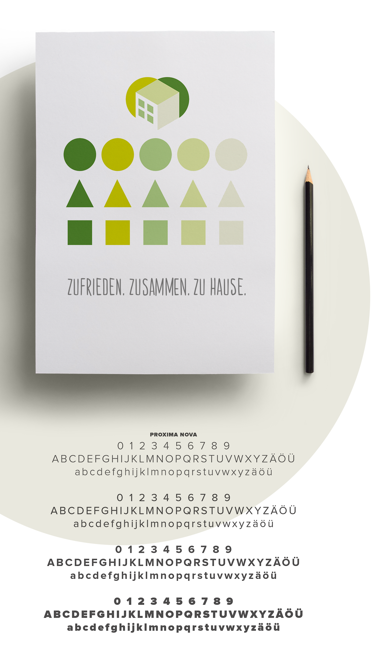
The Wuhletal logo was developed using iconographic shapes designed to reflect the essence of the housing cooperative. By overlapping stylized human figures with varying shades of green, the logo visually communicates the strong connection between people and nature, as well as a sense of belonging and community. The layered composition highlights diversity while reinforcing the cooperative’s values of unity and shared environment.

© 2025 Ricardo Quintas. All rights reserved.