
Client / Employer
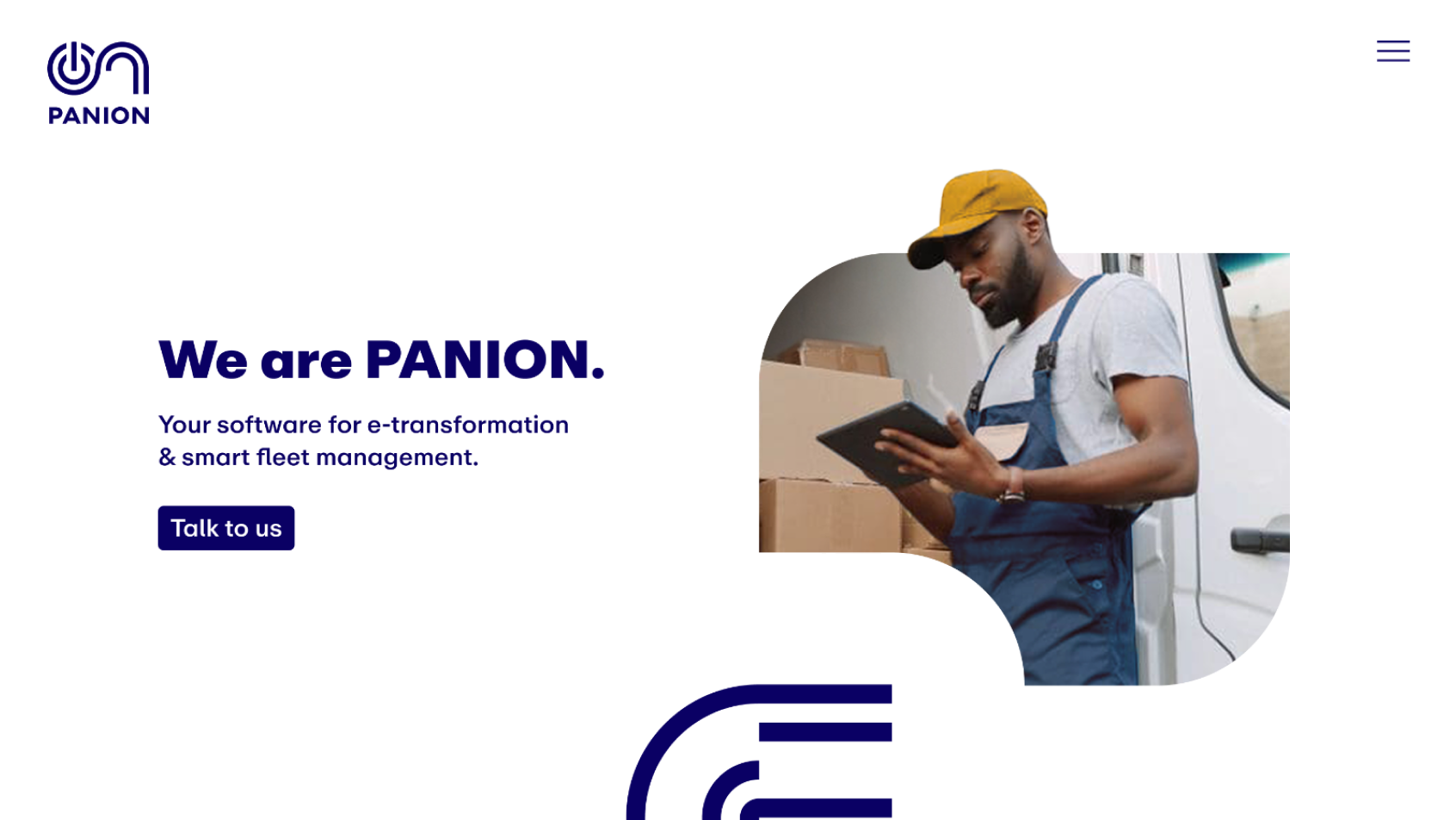
PANION
ABB eMobility Digital Venture
PANION is an ABB-backed start-up offering SaaS solutions for electric fleet transition and management. Designed to support fleets in their electrification journey, as mandated by law by 2030, PANION was seeking partnerships with companies that operate mid-to-large fleets.
PANION is an ABB-backed start-up offering SaaS solutions for electric fleet transition and management. Designed to support fleets in their electrification journey, as mandated by law by 2030, PANION was seeking partnerships with companies that operate mid-to-large fleets.
When
2022 – 2023
My Roles
Brand Designer
Graphic Designer
UI-Designer
Art Direction
What was the challenge?
As a pioneering product in the market, with no direct competitors (yet!) or established references to rely on, PANION had to pave the way for the fleet managers which could also not find existing content or references to guide their electrification transition.
Given that the product was still in the early stages of development, with ongoing updates and adjustments, there was too few to show and a lot to sell. And to stay ahead of the game, we had to deliver as we go.
How did we solve it?
These challenges also presented a unique opportunity to position PANION as a market leader. We were determined to bridge these gaps and become the trusted comPANION for fleet managers on their electrification journey. Alongside our sales efforts, our presence at key events and fairs, and active social media engagement, our website would serve as the primary platform to provide the missing content and attract the partners we sought.
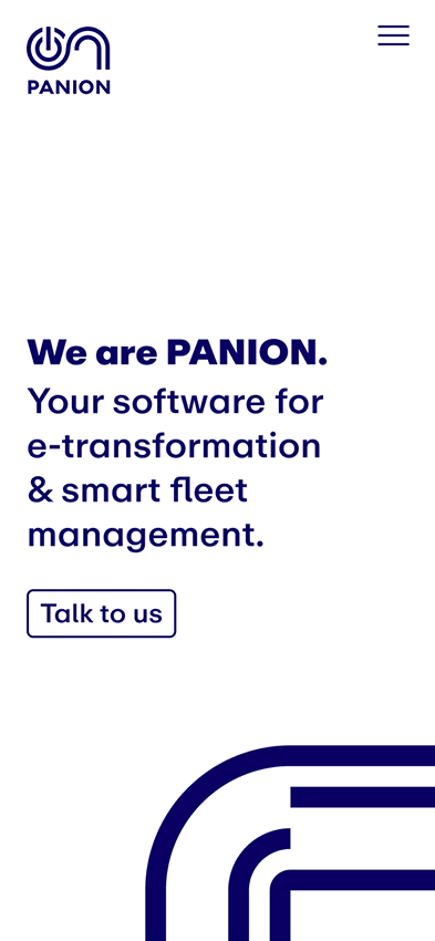
PANION’s Website
A Strategic Web Presence
Our website was designed as a formal bridge to connect with potential clients and partners while we developed our product. As a SaaS company for e-mobility fleets, we catered to both older fleet managers, who are often hesitant about electrification but need to comply with regulations, and younger, tech-savvy managers enthusiastic about e-mobility.
Taking the Lead
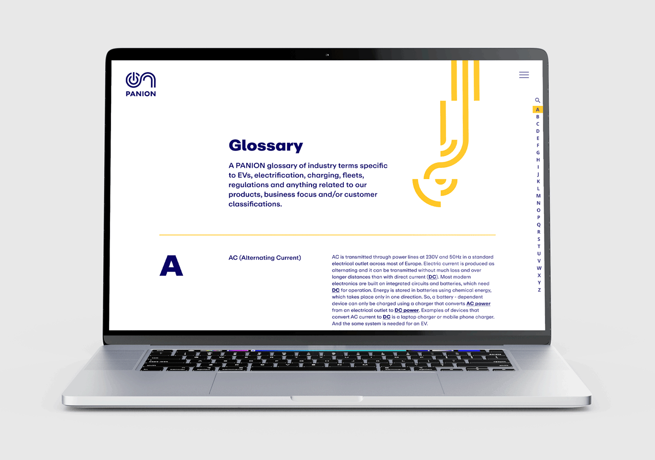
The rapidly growing EV industry has also opened up a new opportunity for PANION to stand out: the creation of a comprehensive Glossary of Electric Mobility-related terms. This initiative not only serves as a valuable resource but also drives traffic to our website, reinforcing our role as the trusted comPANION fleet managers need to navigate what is likely to be the greatest challenge of their careers – adapting to a completely new way of mobility that demands enhanced technical expertise and management skills.
Making Space for Growth
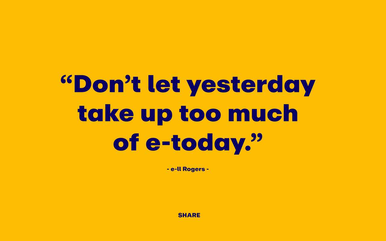
Beyond blog posts, whitepapers, and social media efforts to generate leads and drive traffic to our website, we also launched the PANIONarium – a dynamic platform designed to share easily consumable content. Starting with humorous quotes, the goal was to gradually expand the platform to include E-mobility related facts, images, and more, creating a fun and engaging space for our audience.
Brand Identity Design
Review and Update
When I first began, the brand was built on a work-in-progress corporate identity, which had been used for the initial launch. While a complete overhaul wasn’t feasible due to the brand's recent introduction, our focus was on refining and perfecting it. This included aligning it with both our short- and long-term goals, as well as adapting it based on insights from market researches.
Additionally, we needed to evolve the brand to support its dynamic growth, anticipating changing needs as the brand expanded.
Logo
The logo was simplified, and color variations were reduced to ensure clarity and recognition at smaller sizes and a more consistent and cohesive look across all platforms and touchpoints.

Lanes
The existing three lines representing the products quickly transformed into car lanes, becoming a central element of the branding. These lanes not only guided the viewer's eye but also played a key role in the storytelling, suggesting time and rhythm, particularly when animated.

Typography
A more suitable font was selected to fullfill our digital product needs and effectively convey the intended tone and impression. This change improved readability and strengthened the visual connection with the brand.

Color Palette
The yellow was adjusted to improve accessibility and enhance contrast, ensuring better distinction. The blue hue was intensified to intensify its vibrant appearance and prevent it from being mistaken for black.
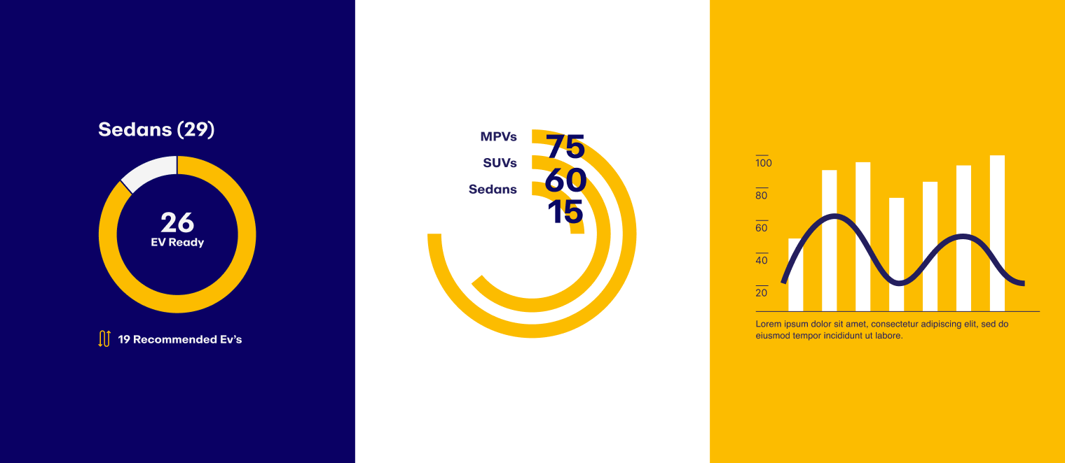
Infographics
Infographic templates were designed to be used in a variety of assets, including Keynote presentations, white papers, flyers, and other marketing and sales materials. These templates were also to serve as foundational designs, enabling the development of more complex, customized visuals for our product.
Iconography
Three icons represented each one of the main functions supported by the product, which was initially marketed as separate products. Additionally, a comprehensive set of icons and guidelines was created to ensure consistency on the expansion of our icon library which would be used across marketing materials, sales presentations, and the digital product itself, facilitating easier navigation for clients and stakeholders.
Marketing & Sales Assets
Note : Designed with previous corporate design
Flyer Design & Event Booth
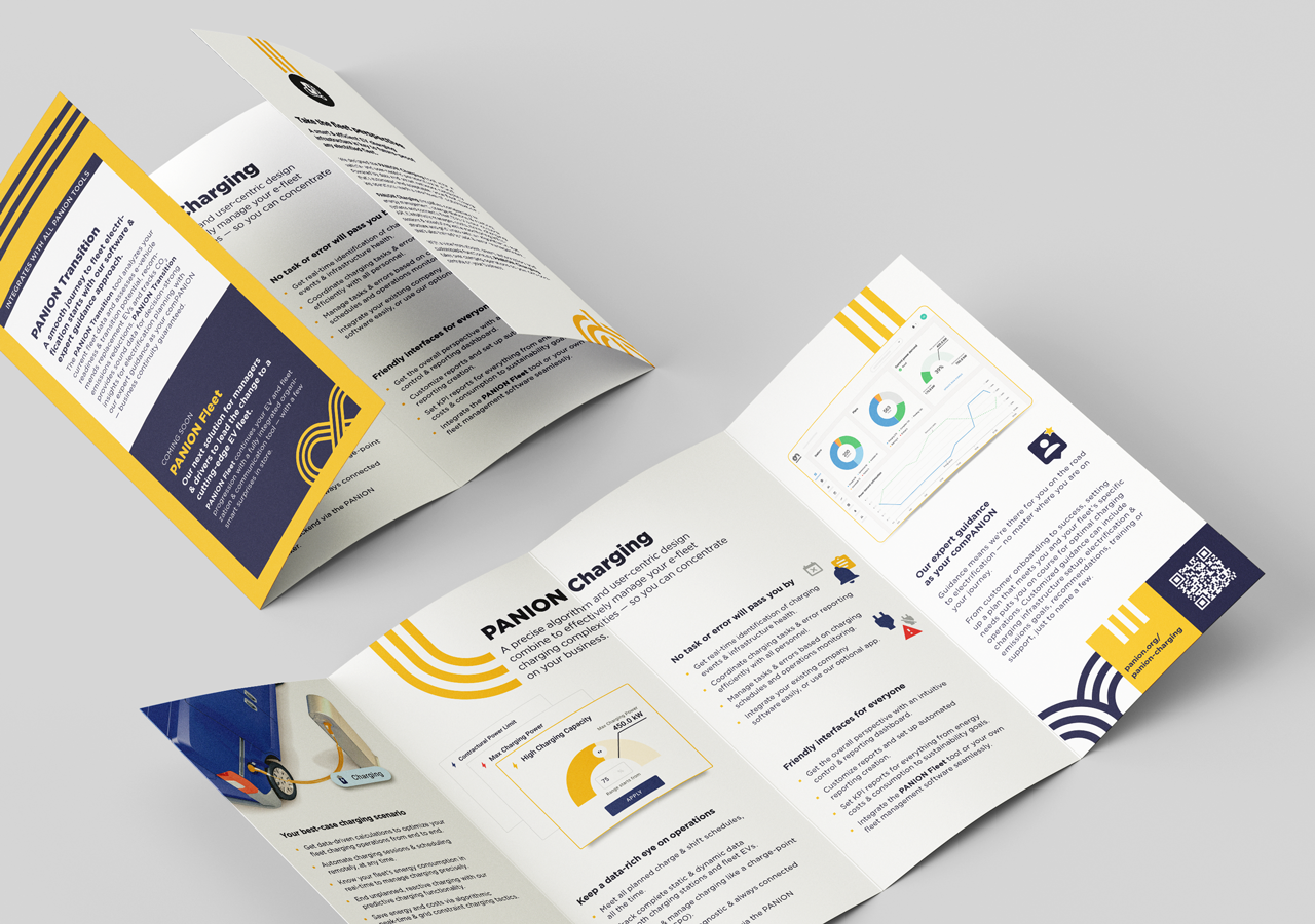
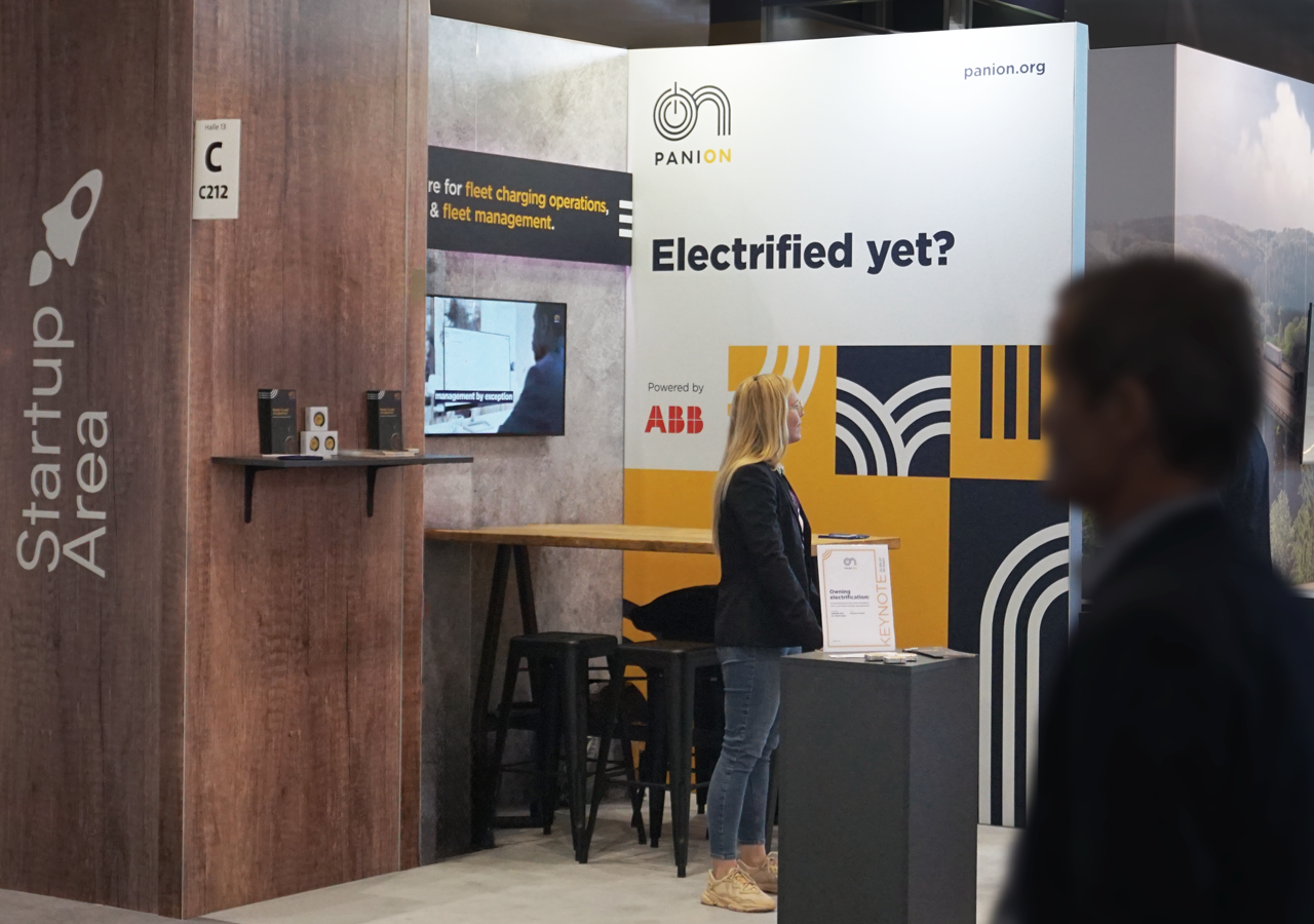
Each of our products would have a flyer, highlighting key features, benefits, and UI, while also cross-promoting the other products. This became an important brand asset — often serving as the first impression for potential clients and distributed at all industry events. In addition, I designed our event booth stands, counter and roll-up to ensure a cohesive and professional brand presence. All assets were crafted to clearly communicate our offering while reinforcing consistency and credibility.
Social Media & Content Design
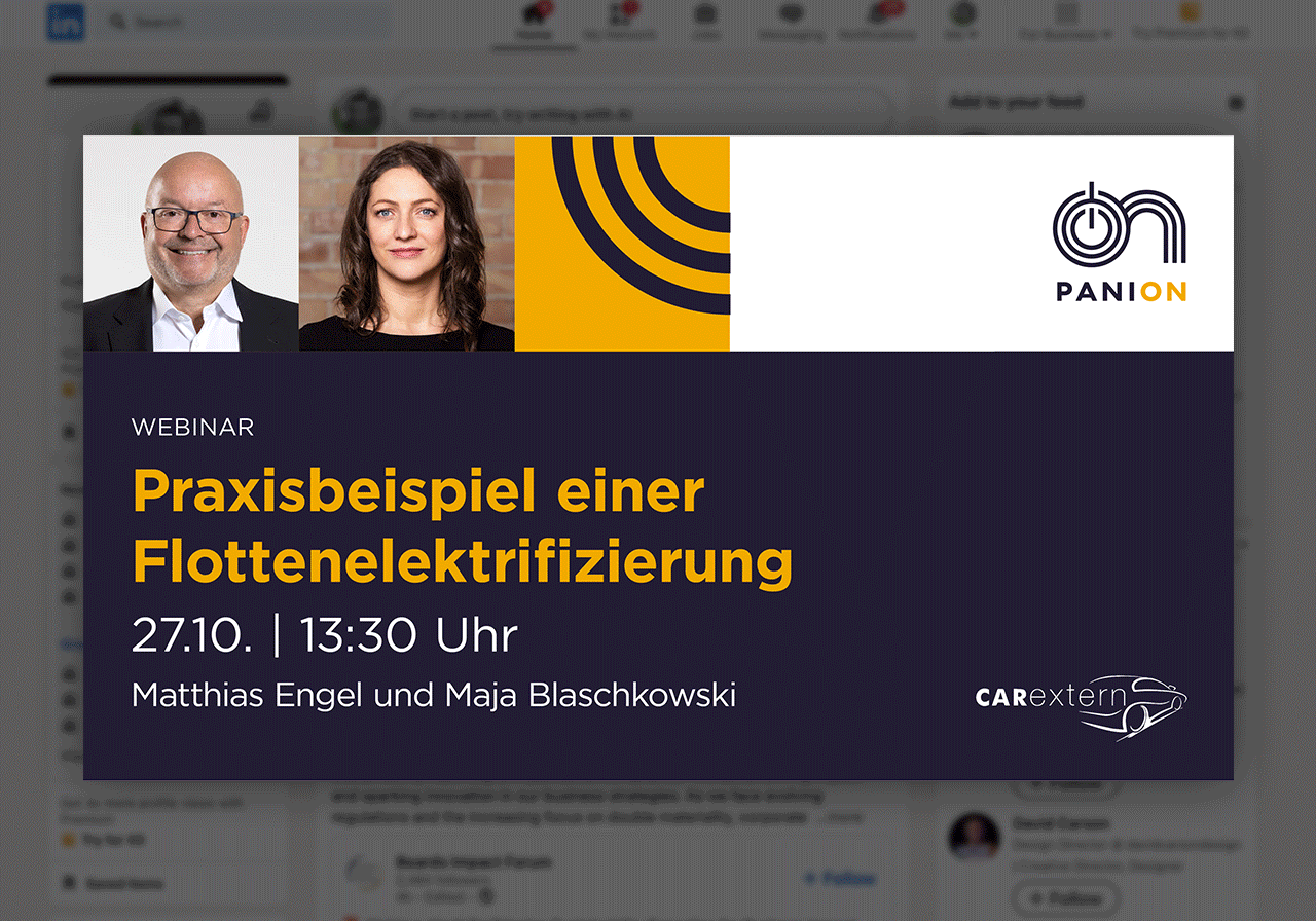
At PANION, I designed social media content spanning team updates, event participation, keynotes, Webinars, blog posts, white papers, and awareness days. I also developed templates and visual guidelines to ensure consistent, on-brand communication, and contributed to content planning aligned with our marketing goals.
Product Explainer Video
I led the creation of an explainer video introducing PANION’s software to the Sales team at our parent company, ABB e-Mobility. Starting from the content designer’s script, I developed the storyboard, defined the visual direction in line with ABB’s branding, and coordinated with an external partner responsible for animation and editing. The video was designed to clearly communicate the product’s value and functionality to a wider internal audience.
© 2025 Ricardo Quintas. All rights reserved.